ShopDreamUp AI ArtDreamUp
Deviation Actions


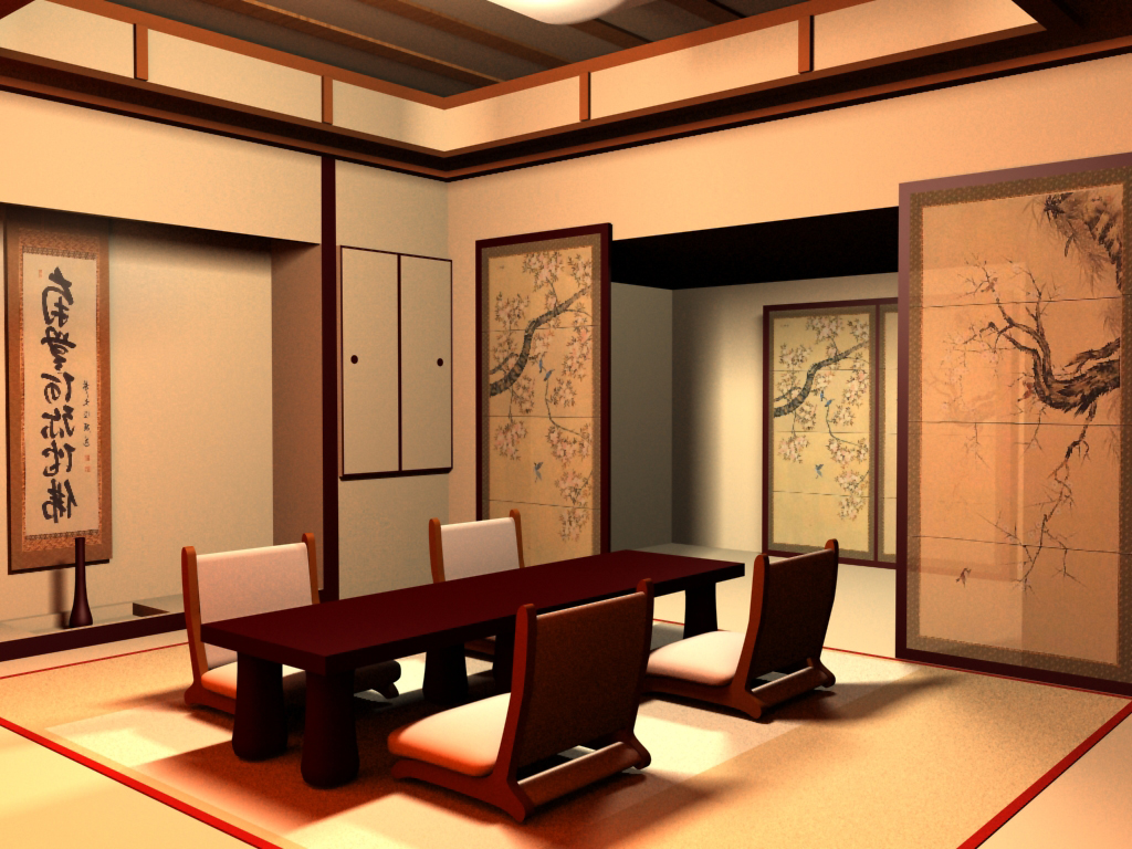
Description
inspired by a growing interest in many things Japanese.
Image size
1024x768px 584.95 KB
© 2005 - 2024 chrispallaris
Comments35
Join the community to add your comment. Already a deviant? Log In
When i first clicked on the thumbnail, I thought this was something real ")